Carbon Count
Company
Z Energy
Awards & Mentions
- CIO Awards Finalist
- Stuff.co.nz
- 95B FM Podcast
Responsibilities
- UX UI Design
- Creative Direction
Tools
- Sketch
- Overflow
- Adobe After Effects
How might we deliver education and choice regarding fuel emissions to customers using Z App?
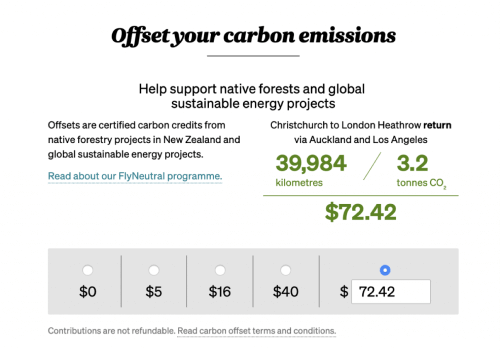
Carbon Count is a feature in the Z App that allows customers to see the carbon emissions of each fill and choose to offset through local permanent forests.
A cross-functional team was put together to deliver Carbon Count in five sprints. The desired outcome was to give Kiwis a unique way to act against climate change while also educating them about the impacts of their fuel consumption.
Design Process
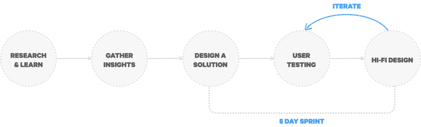
1
Engaged with internal stakeholders to understand business needs, researched about carbon emissions and offset calculations
2
Gained insights about market trends, what other companies were offering and how to improve existing solutions
3
Sketched concepts, created wireframes and prototypes
4
Explored and refined different concepts and user flows
5
Provided dev team with high fidelity designs and assets
Our team developed Carbon Count over the holiday season, while most of us were working remotely and with limited access to external resources.
While I usually follow human-centred design methodologies and start framing the problem by interviewing customers, for Carbon Count I had to adopt a slightly different path and base my research on online documentation and internal feedback.


1. Research & Learn
Framing the Problem
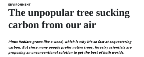
My first step was to learn more about carbon emissions, offset calculations, and how this industry of planting trees to “suck” carbon from the air works.
During the research phase, I learned how Pinus Radiata, despite not being the preferable option to cover the land, is far more effective in removing CO2 from the atmosphere.
2. Gather Insights
Exploring the Domain
Although the practice of offsetting carbon emissions from fuel consumption is still in its infancy, I wanted to find out what other companies are doing to minimise their impact, and how.
I used these insights to guide me during the ideation phase so that our solution was far easier and more interactive to use.


3. Design a Solution
Generating ideas
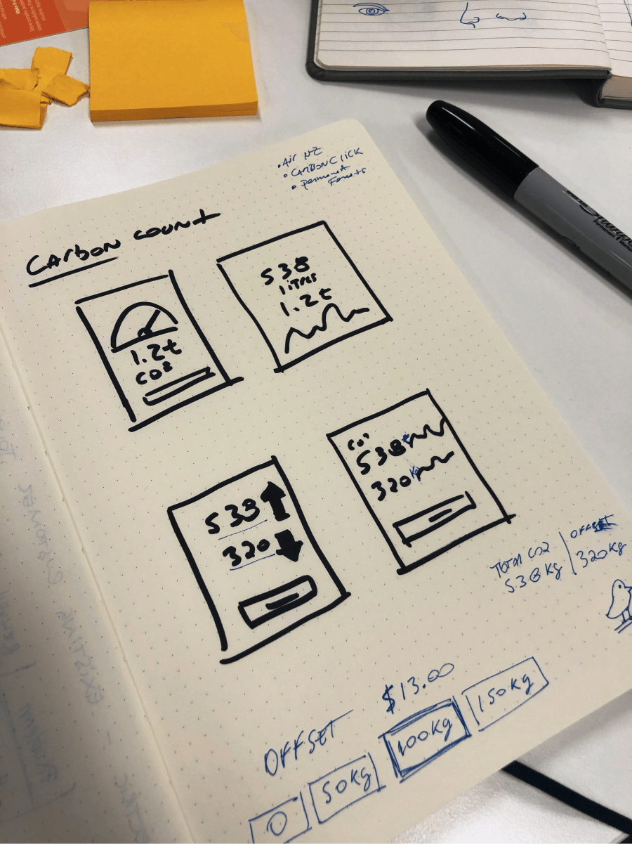
I like to start ideating with rough sketches using pen and paper to get the ideas out of my head quickly.
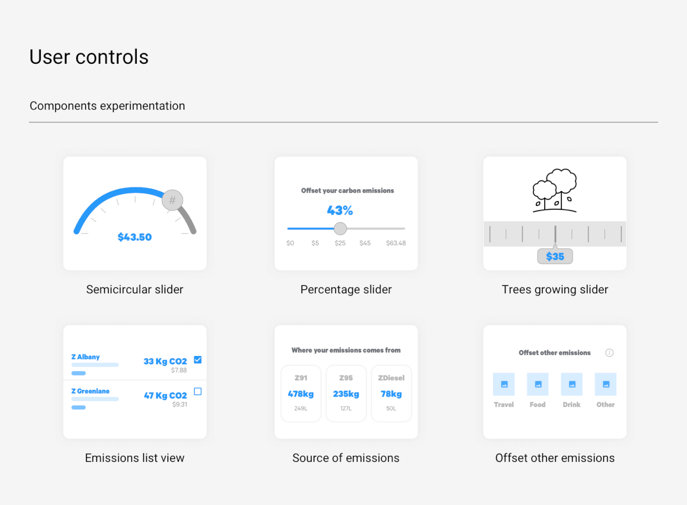
I also researched how different data components could demonstrate the impact of carbon emissions, and if graphs and charts would help the user to understand their data.
Then I created different dashboard views, experimenting with data points and graphs, aiming for a simple experience while also dealing with the technical constraints. During this stage I kept developers and stakeholders in the loop, collecting feedback along the way.


4. User Testing
Visualising data & interactions
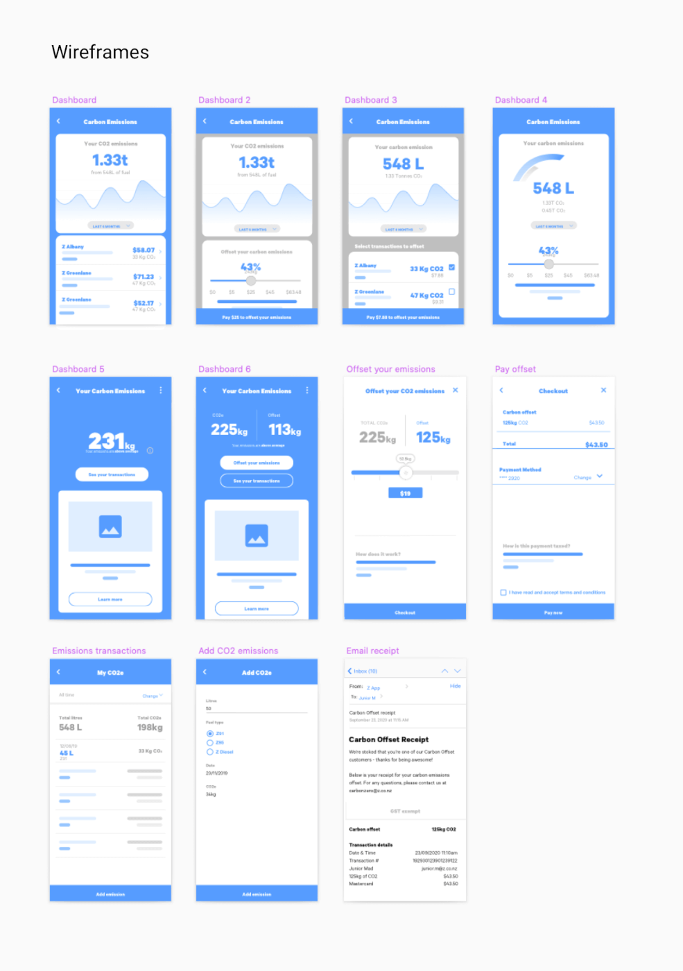
Dashboards
Users found that looking at charts and accessing historical data added complexity to something they weren’t familiar with. The simple version with emission and offset levels gave users clarity and enough information to make a decision.
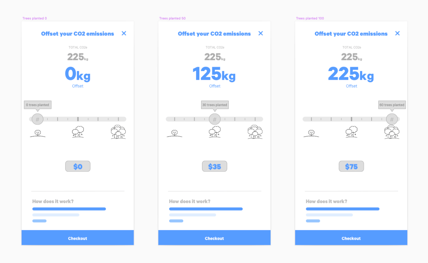
Trees growing animation
Users found interacting with the slider fun and easy to understand how the impact of offsetting their emissions could help the environment. An issue I found with the slider was the position of the thumb on the screen covered the dollar amount which made it hard to see how much they would pay.
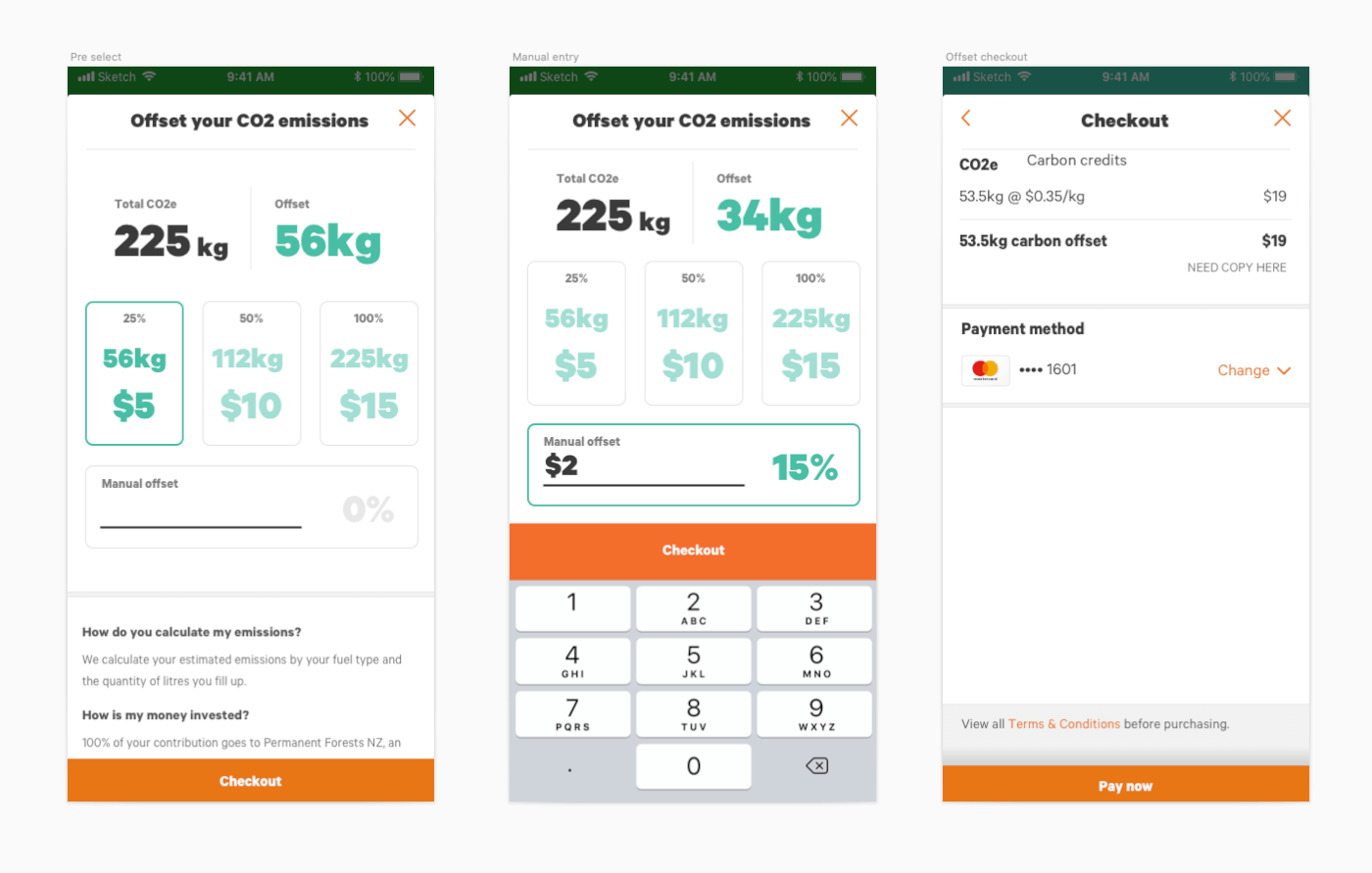
Pre-select and manual entry
Although this option gave users a quick way to select an amount, it also cluttered the screen with too many numbers and added extra effort to manually enter a specific value. We decided to park this idea.


5. Hi-Fi Design
Delivery & implementation
The simplicity and interaction that users validated during user testing were implemented in the final design.
I used elements from the existing design library and worked with an external illustrator to create the final animation.
We opted to have a foggy landscape with some of New Zealand’s native trees and birds. As the user interacts with the slider, the fog dissipates, as a result of offsetting carbon emissions.
Outcomes & Mentions
When we developed this feature, we knew our customers wouldn’t widely and positively accept it due to the general perception that fuel prices are already high. Naturally, customers would hate to see that cost increase.
However, we created Carbon Count because it was the right thing to do, to give people knowledge and choice about their carbon footprint.
As expected, the uptake of Carbon Count was slow and hit our conversion target of 3.5% after launch, which was “OK” compared to one of our partners’ carbon offsetting programmes.
According to customers who used Carbon Count, we heard positive comments about the initiative and how slick the UX was designed.
